Updating our color system — Setting up for success
Our Senior Brand Designer Maja explains the ideation and implementation of the upgrading of our N26 color system.
6 min read
It was no mystery to our Design team that our color palette needed a refresh. As we grew, both as a company and as a collective, there was tremendous pressure for an expanded and stable color system. Our color palette was established in 2018 through a brand refinement. Two years later, it became obvious that we had reached a tipping point of confusion, and something had to be done. I will outline a framework I created for the color update and explain what we did and why we did it.Five phases of the color update framework.
A backstory: Honoring previous endeavors
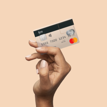
To begin, we needed to understand what had been done before, and the previous decisions that had been made. Back in 2018, N26 was growing exponentially and gaining an early majority. To connect with that audience, we strove to evolve past a “start up” look-and-feel. Hence, we said goodbye to eye-piercing mint and established a palette of four primary and four secondary colors. It was an intuitive call for the brand, however, adding 7 new colors and addressing the internal nostalgia turned out to be more complex than expected.
Phase1 — Synthesising learnings: A hard look at the old color
We started by gaining a deep understanding of the problem. After its initial successful implementation, we observed what was working and what was not with our old color palette. We had a great opportunity to test print reproduction of colors on numerous OOH campaigns. We observed how they were perceived by our customers on social media and during the launch of our N26 You tier, which saw our palette in physical forms in the hardware. By shipping new features, we also observed how colors behaved on the web and in-app.There is a tremendous pressure on our colors, since they need to flex throughout our physical objects, digital products and print.Alongside understanding the problems in reproduction, we noticed a fragmentation in use of colors by the design team and in documentation. Although we had color guidance defined, when it came to cases beyond the brand guidelines, things started to fall apart. Additionally, we used many different tools and sources-of-truth.
Phase2 — Defining the objectives: Set yourself up for success
Setting clear objectives is the best way to keep the team aligned and set up for success. Although only two designers were working on the update, we set clear goals for ourselves, the team and our stakeholders. Even more importantly, whenever we got stuck in a dark and cold void of doubt during the creation, these objectives were our North star:→ The end result should not feel like a rebrand. We had to address problems by finding solutions within the look-and-feel of the existing brand colors.→ The process of adaptation should be smooth. Existing colors should be present in the extended palette.→ We should create an extended palette with clear use-cases that fit the current brand and consider our future vision.
Phase3 — Creation: Understanding the colors and our needs
Having synthesised learnings and held numerous conversations with designers, we got a clear idea what needed to be done; tweaking existing color values and expanding the color offering. We fully immersed ourselves in color theories, HSB color space, numerous online color tools and plugins, and exhaustively tested all the possible palettes. After this, I’ll never look at colors in the same way again.The tricky part was to extend our 8 color palette to 50 meaningful shades while having a clear idea how to document this for future use. But, this is a topic for another article and no doubt very geeky.Color evolution: in 2018 as part of the brand refinement we did a drastic color change. Two years later we refined and expanded the color palette based on the colors established in 2018.A big part of the process was iterating on the color palette and receiving design critique, all while keeping the creative momentum. We enthusiastically tested new colors for each of our use cases. We cranked out cheerful Instagram stories, stress-tested with thumbnails, icons and buttons, and even tested colors for the age of dark mode. We iterated on the details until we were satisfied and able to justify our decisions.
Phase4 — Adaptation: Celebrating the new colors
The color palette was born of fruitful collaboration between brand and product design in the height of the pandemic and endorsed by a team of 60 designers. Getting the thumbs up from a large group of designers was an important milestone in this project, as the future of our colors and their use heavily relies on them. There were three aspects that contributed to the successful color adaptation: clear project objectives as described in phase 2, inclusive work process covered in phase 3 and share outs.We shared our work in many different forms and forums. We made presentations for different audiences: from extended Share & Learn sessions for color nerds, to quick and fun slides for All Hands presentations for the Product and Design team. At this point, the sky was the limit. To solidify and celebrate, we documented the work with case studies, created mesmerizing color animations and posted it on Slack channels, and printed office posters. Being able to communicate your work and generate excitement really impacted the outcomes of our next step.Showcase of how our palette evolved from two colors per hue — today named 500 and 200; and comparison between colors in primary and expended palette.
Phase5 — Implementation: Moving towards the finish line
Implementing color throughout various touch-points can feel daunting. For designers to start exploring and using the new palettes, we created substantial documentation and updated libraries in design tools. For a larger reach outside of the Design team, we needed to establish a roll-out plan that would also encompass our product and app experience, website and CRM channels. We prepared a translation map that provided an understanding of which color values had been changed. In scaling from 8 to 50 colors, came the need for definition of color use-cases. For example, buttons have an active and passive color state, but now we added a color value to their hover state.Our libraries support various design use cases. For example, in library we defined all the possible states of button for light and dark mode.The project started as the WHO announced a world pandemic, and today, we are in the implementation stage with an end on the horizon. We also agreed to a one year freeze of color values to ensure a stable design system, cohesive visual narrative and peace of mind.Our new palette improved visual accessibility, provided the designers a playground for exploration, and future endeavors for product and brand. Looking back on the extensive body of work we undertook, we brought a maturity to our brand and product, but not without adding a certain degree of complexity to the design system. That said, as we know designers are the most frequent users of a design system; we know that new colors are in good hands.I was a design lead on this project and just as how a single color cannot shine alone, this work was a close collaboration with a fantastic Senior Product Designer, Emanuel Milicevic. He led the color implementation in product and colors for dark mode. N26’s new color palette was also created with constant support and design critique from the brand and product designers.Visuals we created by me and animation by my dear coworker Guil Mauler, Senior Motion Designer.Head here to see part 2 of this article on coxtentualizing colors.