Our Senior Product Designer, Emanuel, guides us through the steps the team went through to contextualize and implement our new N26 color palette in our product and brand.
7 min read
Color is one of the key parts of your brand. It’s also one of the most exposed. Therefore working on any intervention regarding the color palette can be very tricky, no matter the size of your company. Our brand designer Maja and I embarked on the journey of scaling the N26 color palette from 8 shades to 50 shades, in the peak of the 2020 pandemic.Firstly we observed what’s working and what not, across all channels. Then we synthesised our learnings and proceeded by setting the objectives of the initiative. One of the key objectives was that the end result should not feel like a rebrand. We need to expand our color palette to be more flexible within the existing look-and-feel. Once we designed the final palette, our focus shifted towards the finish line. Following sections will give you some geeky details about our approach on adaptation and implementation of the color palette.
Moving towards the finish line
As our shiny new color palette was about to be made available for everyone, we had to keep our focus and play the last seconds as if they were the first minute of the game. In the first phase we listed out all the touchpoints we needed to think of while scaling our color palette. To be able to track implementation, as with any other project, we created a task for each touchpoint with clear statuses. The strategy was first to implement updates to the design team and then scale across the company by applying colors to brand assets and the design system. The ownership of tasks was mostly divided between brand or product designer. In the following sections, I will share more implementation details with a focus on the product challenges.
Brand implementation
To implement colors for the brand team, we had to understand their context of work and usage. Our brand team mostly tailors their work with Adobe tools, and now more recently with Figma. The key objective for the brand team was to update Adobe Libraries by implementing the new color palette. From that point it was easier to scale implementation to other touchpoints like physical and digital brand materials, videos, internal tools, presentations, and documents. To make implementation even easier, we included our approach into an updated set of guidelines, so that everyone could use it.
Product implementation
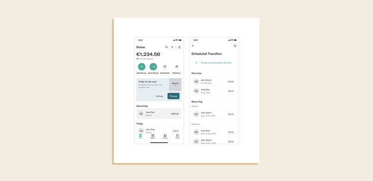
In a nutshell, product implementation was the same as for the brand team but in a different context. The products that we had to keep in mind were the Website, Web-app, and native apps. Since our product teams work mostly in Figma, the logical step was to clean up the colors and implement a new color palette into the color styles of our design system library file. Once we had everything ready, the next thing was to apply colors to UI components and deploy the update via the design system library file. After the product teams pulled the updates, their design files were up to date with the latest color palette.Design files are not a product that users interact with, and a design system is not just a design file, but also code (and more). So we synced with the engineers on how to effortlessly implement our shiny new color palette. Even though we collaborated on the project all the time, during this last mile we noticed that “design colors'' and “engineering colors” are not the same colors. Whaaat? Yes, we were talking about the same thing, but we didn’t share the same language. The designer’s mental model of colors implementation was not aligned with how it’s done in reality. Aha! The light bulb turned on, followed by “Eureka”!Okay, what is the solution? How do we make sure that we speak the same language? First, we needed to understand the implementation in more detail. So we did our research by talking to engineers, looking at the code, and visualizing the flow. At N26, colors are implemented as follows:
Color Palette – It’s the list of color names. The color value is assigned to a corresponding color name. The same as the extended design color palette.
Contextual Colors – A list of colors where a name of the color presents the context of where this color is used (i.e. background container). Two meaningless colors from the color palette are assigned to one contextual color. In the code it’s assigned via color configurations. This way a contextual color consists of two colors, one for light and one for dark mode, in our case.
Component – Contextual color is applied as the color for a component. This way color can switch between modes depending on the theme.
To speak the same language, we had to first overcome a language barrier. We achieved this by implementing contextual colors into the design system library. Now we have the same contextual name for code and design. For designers, this means that you are no longer looking for Teal_500, instead you are looking for a context of use, i.e. interactive typography. As you search for this color in light mode, you will also get a result for dark mode. This serves as a constant reminder to think about how it will look in dark mode.
For engineers, this means that by inspecting elements, you’ll get contextual color names instead of meaningless color names. This way you will be able to implement exactly the same color.For the product, this means higher quality and consistency, as colors need to be aligned between design files and implementation in the product. For the company, this means saving time (which equals saving money) on manual work to prepare a dark mode design, while leaving more time to solve our customers’ problems.As we added contextual color styles to the design system library, we applied them to components, and pushed the update for all teams in the company.In addition to the brand team’s color guidelines, we’ve built the color guidelines for our product teams. The basic color palette is the same as for the brand team, but the usage is different. The Color System is where we have listed out all the meaningless and contextual colors used in the product. This system already existed, so we had to update it with new colors. To facilitate the implementation phase, we created a translation table in which the current colors were mapped to the new ones. After we close all the tasks we’ll then remove old colors.
How do we choose the colors in the product now?
If we think about how product designers will use colors from now on, they will do so in three ways:
Via system components – Designers will use system components and don’t have to think about colors at all.
As contextual colors – Designers will search for contextual colors from the color styles.
By exploring and adding a new contextual color – When they find a perfect match, they will first check to see if there is a similar contextual color. When this is not the case, they can add a new color based on our documented guidelines.
Every system is evolving and we don’t think we’ve created the final contextual color palette. That’s why designers can use a meaningless color palette for exploratory work and contribute to the design system.
Colors appear almost naively simple, but as they have to flex across product and brand, they become unbelievably complex.
During this project, we communicated with a large number of stakeholders. We knew it was important to make sure you shared the same understanding with the rest of the team. Most of the time we were constantly aligned, but there were moments when we thought we shared the same understanding and later realized we weren’t aligned with the way colors are implemented. Luckily for us this was “just” an extra step in the process, but it could have been an extra week of work as the colors are used in each team. The lesson learned here is to make sure you are on the same page. So next time, during the research, ask your cross-functional team “What else are we missing?”. Close conversations and meetings with a clear conclusion “We have concluded this. Are we all aligned on that?”, and get the thumb up from all attendees.From one brand and product design stand-up, two initiators, 60 designers and engineers, we ended up having 50 scalable colors and aligned visuals across the channels. While our implementation phase is still ongoing, I’m looking forward to wrapping up this project with an improved user experience, and without any noticeable changes for our customers.A big shoutout to our amazing Brand Designer Maja Tisel who led this project, and to Fabio Carballo, Ivan Damjanovic, and Leo Weigand for having patience with all my implementation and coding questions. And to the Brand and Product Design teams that supported us along the journey. You rock!