N26 Metal may have caught your eye. Read below for a peek into the process of branding the Metal experience.
6 min read
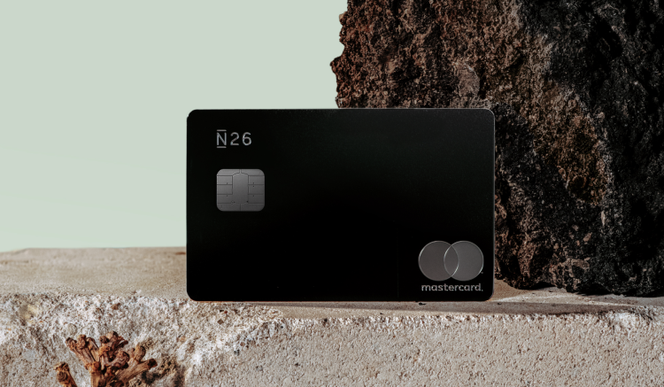
In early July 2018, N26 launched Metal, Europe’s first contactless metal card. As a Brand Designer on N26’s design team, I was lucky to be part of the group tasked with the effort of branding and marketing the Metal experience. The process was a long and rewarding collaboration between multiple teams at N26, and I’d love to share how this unique concept came to life.
The Concept for Metal
With Metal, the N26 Design team strove to create a brand that not only reflected the premium nature of the Metal card, but also the product’s ability to embed itself into the user’s lifestyle. Actively calling for our user’s to “make a statement” with the card.Instead of drawing inspiration from other financial players, we looked to brands that are disruptors in products that we use, or want to use, on a daily basis. In a time that people are placing an increasing importance on self-labeling via brands, we looked particularly at companies that place an emphasis on the aesthetic qualities as a reflection of the substance of their product.
Branding
The branding positioned Metal as a lifestyle-oriented product. We leveraged traditional brand elements such as color, typography, packaging and art direction to work towards the common goal of giving Metal a tangible personality. The positioning was aspirational, but rooted in the idea that the product must be interacted with.
Color
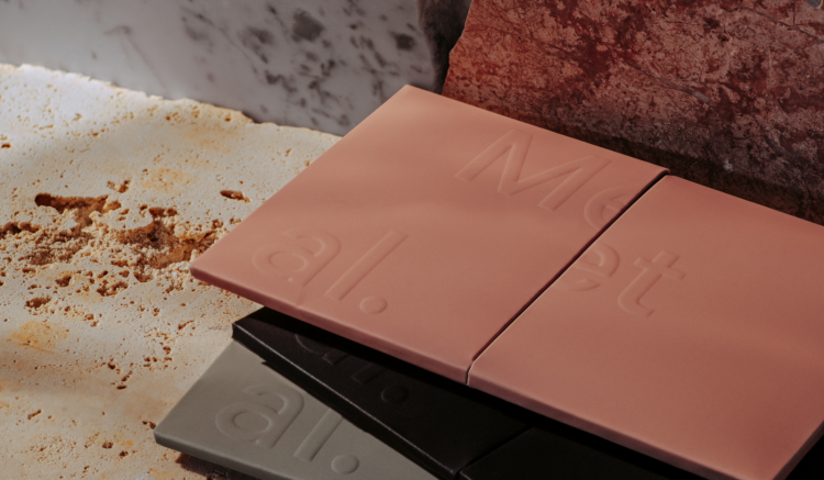
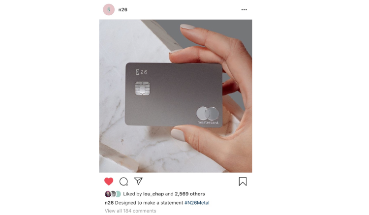
The hero Metal color was an evolution of our brand color at the time, mint. We decided that when selecting a color we wanted to elevate where the N26 brand was. We introduced a green with humanist mossy undertones that feel derived from natural materials.The new soft teal is human, unique and speaks to a considered and thoughtful aesthetic that is a large part of our Metal offering. Teal, which is the branding color for our charcoal black Metal card, in addition to the quartz rose and slate grey cards, resonated with our customers via earned media. In the 90 days after the launch of quartz rose and slate grey cards we found users shared Metal tagging #N26Metal on their organic channels, 120% more than they tagged #N26Black for our Black offering, despite having a smaller, yet growing base.
Typography
The animation behavior onto the type treatment evokes the sense of unconventional and dynamic movement: a brand and product that makes a statement.We chose to apply a separated type treatment, repeated on all of the physical and digital touchpoints of Metal.This separated type reacts and changes once spurred by user interaction (e.g. the loading of the page, or the pulling of the package). This typography treatment, unconventional for a finance brand, speaks to the agency we want to give the user. Unlike a traditional bank we’re giving room for our user’s uniqueness. Their financial lives, and the way they use Metal, is personal, dynamic and inherently “makes a statement.”
Packaging
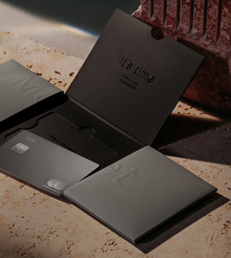
The packaging was one of the most important touchpoints for us with Metal. It is important to take the opportunity of a rare physical touchpoint in our digital product offering to create an emotional connection. We took this often neglected moment of banking, the delivery of the card, emphasised the tactility and craft of the product.Together, with Progress Packaging, we developed a bespoke dieline and custom packaging that spoke to our brand values and the tone of voice for the Metal product specifically.The aesthetic qualities of the packaging are intended to mirror the minimalist design and craftsmanship and beautiful execution of the Metal card itself. The decisions on the design of the package make the Metal’s product and messaging more understandable and clarify our value proposition. The soft-touch varnish on the paper and the subtle raised relief of the lettering read as a self-explanatory message of materiality. Most importantly, the packaging is unobtrusive in its safe delivery of your N26 Metal card.
Photography & Art Direction
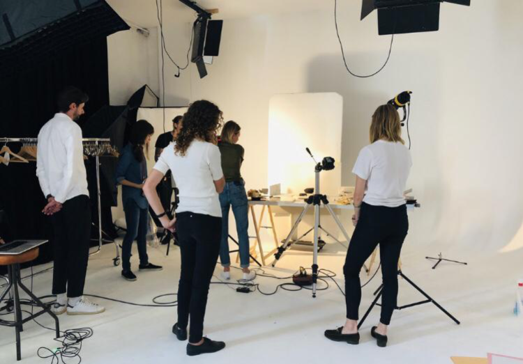
In addition to the packaging, we art directed a photoshoot in collaboration with Lena Smirnova, a prop stylist and a lighting director. The photoshoot vision placed Metal in an environmental context that would feel aspirational yet attainable, introducing a human aspect via hands that is later reflected in our OOH (out of home) brand campaigns.Inside the design stream the motion team translate visual communication into animation and video content materials become an important touchpoint in any product launch at N26.Because of the premium nature of Metal, the motion team drove additional resources, including a freelancer, Juan García Segura, into the production of all of the teasers and promotional materials. Working in collaboration with the brand team to create brand equity in their message focused on tactility, craft, and innovation in a stunning video.
Building Hype
We knew that we wanted to do something deliberate for the Metal launch, so together with the Video and Marketing team we created a series of teaser images and videos, which performed very well and built hype successfully, securing strong numbers upon the product’s release.
The Results & Feedback
The results for Metal have been a strong indication that our message and product resonates with our users and fulfills a real market need in Europe and the UK.The image of our slate grey card garnered the most organic engagement ever on any N26 Instagram post, and helped give us a better understanding of our customers’ branding preferences, giving us valuable data that we will leverage on future brand campaigns and organic posts.A strong sign that our product and its messaging are resonating with our customers is their proclivity to share photos and include images of the product on personal social media. That was something that worked more than well for Metal, as we garnered some of the largest earned media across all of our featured social channels.
And that’s a wrap
Thank you again to the cross-team collaboration that went into this launch, particularly the teams inside of the design squads, such as the Video team, Hardware Design as well as the strong collaboration with the Marketing team and Product teams for implementation.We hope you enjoyed this closer look into Metal’s branding, and insights into the N26 Design Team’s process of designing an experience for a product launch.
Interested in joining one of our teams as we grow?
If you’d like to join us on the journey of building the mobile bank the world loves to use, have a look at some of the roles we’re looking for here.Follow us on LinkedIn and Twitter to keep updated!